
Styling a Bookshelf
Choosing and placing objects alongside your books.
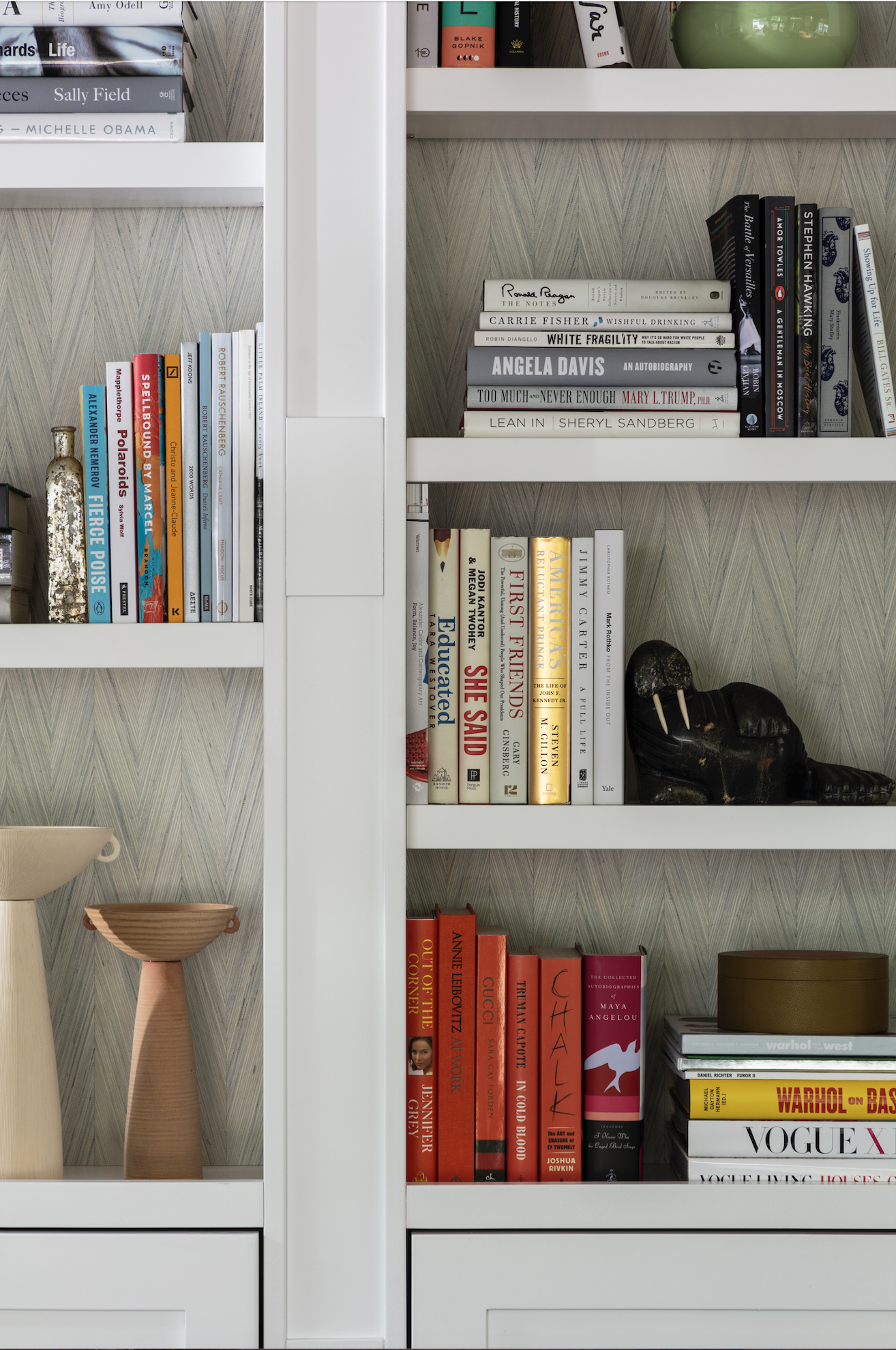
Boulder home library project. Curated and arranged by Foxtail Books.
By Tara Cheesman
A friend once complained about a trend she noticed in friends' homes, "I'm sick of empty bookshelves. So many people pay for beautiful built-in bookcases they don't have the books to fill." This person is a reader but far from a bibliophile. What she does appreciate are well-designed spaces. And while we both laughed at her comment, deep down, I admired the sentiment and the passion behind it. Of course, at Foxtail Books, our favorite styling trick for bookshelves is to fill them with books, but that's not always preferable or practical to most people's lifestyles. Below are some of our best tips/techniques.
The items you choose should be texturally different, so it's best not to go on a shopping spree. Too many brand-new things look staged. Too much vintage can make your home look like an antique shop. You want to create a balanced mix of new with old, hard with soft, shiny with matte. You don't want the things you display to match, but they should play well together.
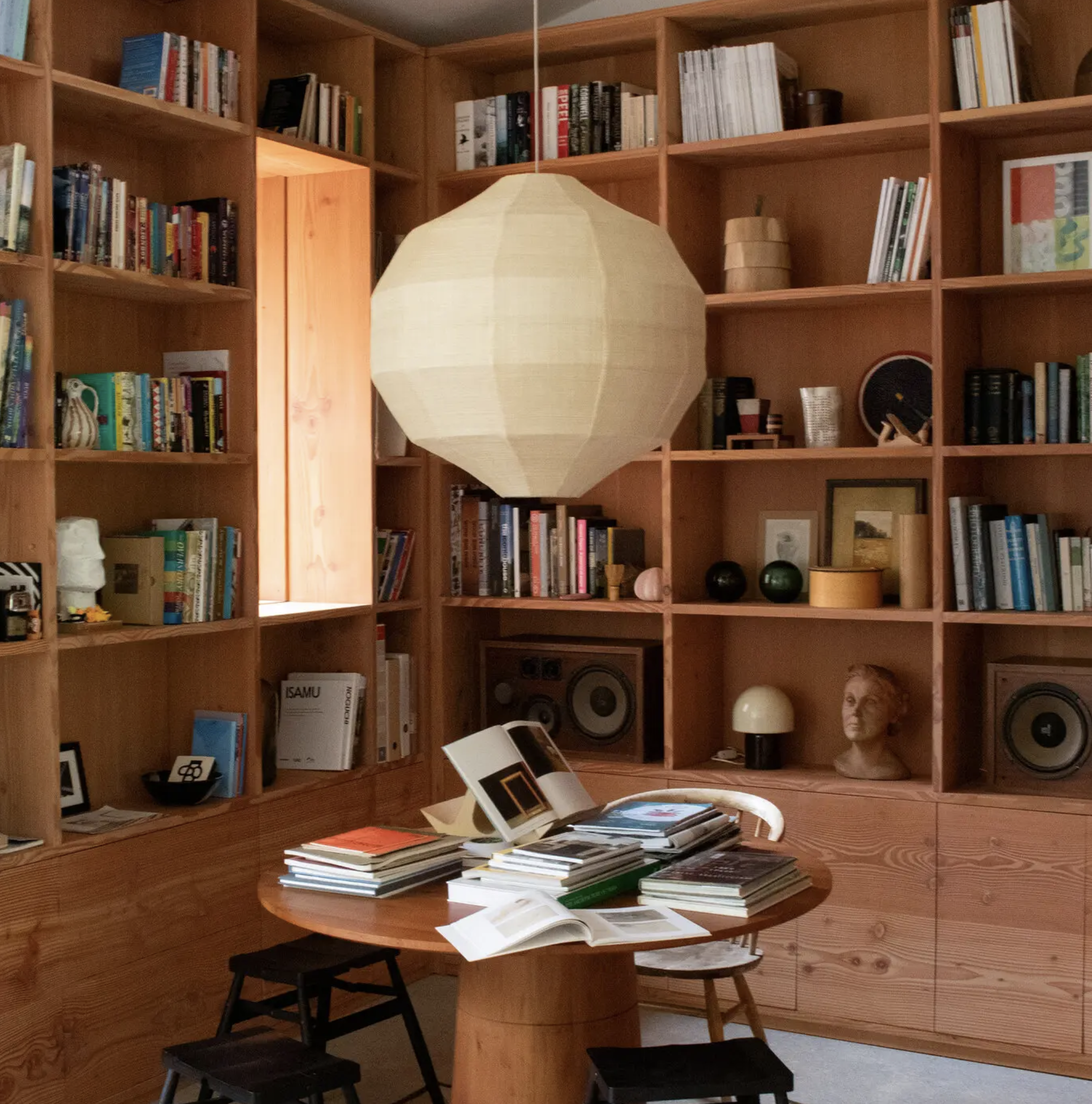
Try to think in three-dimensional space. In an interview, the London-based interior designer Rita Konig spoke about the effect of layers of furniture - of looking past furniture and seeing other furniture beyond. She meant having something positioned in the foreground of your line of sight, which compliments the item in the background. What do you see between you and the bookshelves if you're sitting in a chair on one side of a room? Is there a sofa floating in the space between? Is there a console table behind it? What objects have you placed on the table?
“You want to create a balanced mix of new with old, hard with soft, shiny with matte. You don’t want the things you display to match, but they should play well together. ”

Park City home library project. Books, design, and arrangement by Foxtail Books.
“Even if you’re going for a very formal, balanced look by utilizing matched pairs, more often than not, three objects arranged together and mirrored on either side of a fireplace (for example) will look better than single pieces stationed like sentries.”
Ralph Lauren, perhaps my favorite designer, is currently having a bit of a renaissance. He pioneered the idea of "lifestyle" merchandising. Ralph Lauren's home and fashion collections are aspirational: the castle of a British rock star, a solitary writer renting a beach cottage on the Vineyard, a young ingenue in a garret apartment, a British safari camp, and a modern Aspen retreat. It might feel silly at first , but it does simplify things. Objects are chosen and designed with an imaginary individual in mind and organized to look as if they'd been accumulated over time. To achieve something similar, style your bookcases so the items you place amongst the books tell a story. Use a collection of toy dinosaurs and real fossils for a child fascinated by the Mesozoic Era. Or showcase the souvenirs you've accumulated while traveling. I once visited a Parisian pied-à-terre where tourist tchotchkes (host gifts from friends) were displayed alongside the owners books, and it worked brilliantly! Partly because each tchotchke was a personal connection to a friend. But also because of the uniform whimsy of the collection. Other possibilities – a collection of small white vases; rare minerals (agates, crystals, certain rocks); framed art. Common objects from nature (pinecones, dried pods, seashells) collected on family hikes can appear surprisingly sophisticated.
Home library of Russell Pinch and Oona Bannon, from T Magazine.
Remember the Rule of 3. The number three is misleading, but "stick to odd numbers" doesn't have the same ring. Use three to five objects when creating a vignette. Odd numbers also work when you're breaking up groupings of books on a bookcase; plan for three, five, or even seven breaks per bookcase (depending on the size). Fill each niche/space you've created with one large object for drama or three smaller ones grouped tightly together. Even if you're going for a very formal, balanced look by utilizing matched pairs, more often than not, three objects arranged together and mirrored on either side of a fireplace (for example) will look better than single pieces stationed like sentries.
When creating a grouping, a foolproof trick is to arrange three objects, so they visually create a pyramid—using items of different heights, with the tallest in the center back. Position the other two articles forward, one slightly more so than the other, and flanking the central object. A triangular composition also works with framed photographs layered and leaned against a wall.
And the trump card, when it comes to design rules? Keep it personal. Looking authentic and true to your own taste, life, and books is more valuable, aesthetically, than getting it “right.”
Tara Cheesman is a freelance book critic and a National Book Critics Circle member. Her work has appeared in The Los Angeles Review of Books, CrimeReads, Guernica, Vol. 1 Brooklyn, The Mystery Tribune and other online publications. She received her Bachelors of Fine Arts from the School of Visual Arts in New York City.