Shelving: Dimensions and Spac
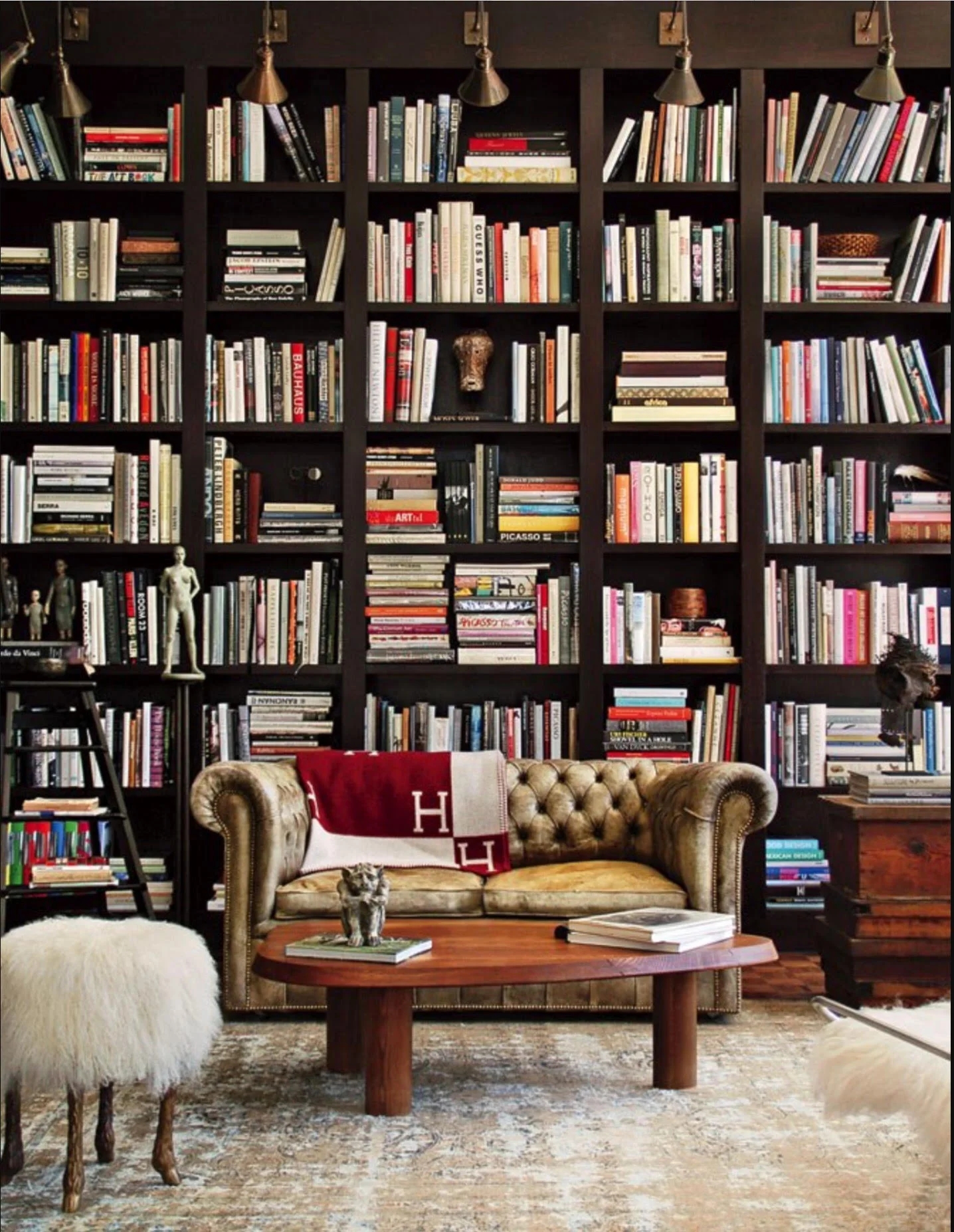
People are drawn to a wall of books spines crammed one after the other. No matter the room, no matter the shelves. No matter the books, at first glance. It's the simple mass of them all. This is part psychology (any grocery store manager could describe the preference for multiples) and partly our love of order (as ever popular blog Things Organized Neatly shows). A wall of books also draws on our sentimentality. At a glance, we recall the feeling of the books in our lives. Those spines remind us of the experiences in pages we have all had as well as experiences reading yet to come. We associate a multitude of books with stories and the act of learning, particularly if we harbor a lifelong love of those things.
Social media does many things for us, the beast, including new ways of quantifying societal taste. In my recent exploration of that landscape, I often see statistical evidence of this phenomenon: we love a wall of books. I could post all manner of pretty things, lovely old books, gorgeous architecture. I could post interesting things, news and scholarship and ideas about libraries. It is always the huge walls of books, books, books that garner the most likes and clicks. It's hardly even a contest: the audience, be they homeowners, interior designers, or simply book lovers, is obsessed.
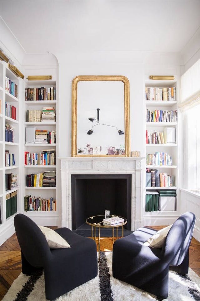
In the home where books are a central element, shelving size, shape, and scale are worth some deliberation. The range of quality, size and style of shelving is wide. The diversity of the books that may fill them is even wider. Shelving is the skeleton for a collection that can be a dramatic element in a space. If resale value is of utmost importance, choose adjustable-height built-ins or moveable furniture. For more a permanent design in a museum-quality room, spend the time to review collection, reader, and space together. It is the dimensions of how books will fit and fill a wall that make the room. Shelving is an investment in one's books and reading as much as it is in the value of the home itself. As with any architectural or design feature, it can be an unspoken, almost unnoticed beauty or an intentional piece of art that draws attention. Though as with other features, take caution in creativity that might walk the border of unique and strange (or simply unusable).
Part of my job is to measure library shelving in order to fill it from end to end, top to bottom: How many square feet have we here? What sorts of books does the room or the reader require? How many of those certain sorts of books fill that many square feet? It can be a simple equation if the shelving is traditional and the organization scheme, straightforward. The challenges that can arise? Shelves that are too short for the books at hand, or those that are awkwardly tall, leaving a strange gap that doesn't rest well with the scheme of the room. Unless one reads only poetry and trade paperbacks, minimalist shelves or those designed as space savers can be too shallow. The more art books, the more overhang, and no one likes too many sharp corners out over the floor for shoulders or small heads to run into. Less common are shelves that are too deep, sometimes having been originally installed in a space meant for sculpture or artifacts. Even en masse, small books drown on surfaces that are too deep, tall or wide for them. Shelving decisions are luckily only as complex as the reader: there are standard heights that work for most books, assuming one's tastes are popular mainstream-published fiction and nonfiction. If you have more diverse and in-depth interests, you're going to need more interesting shelving options.
Shelves look best if they measure just an inch or two higher than the books they hold. The majority of contemporary American pleasure-reading books are a standard size: eight to ten inches tall. The conundrum arises in the variability of what you read: books can be as small as a matchbox or as big as a writing desk. We all have completely different taste, and the books to match. If you read about natural history, your books will surely be larger than most. Art history, same. History and Biography? You're safe with the usual size. Unless you prefer some pictorial review of those eras, in which case your collection will include many sizes. It works to turn one book on its side for display or just to make it fit, but more than a dozen can be frustrating unless your shelves are adjustable.
"But what of adjustable shelving," you will say, and I will sigh. I have a love-hate relationship with that convenience. If we could all have the luxury of having our shelving redesigned every time our taste in books changed (or if publishers went mad and standardized our book sizes) I would vote that we avoid adjustable shelving at all costs. The peg holes for the shelves irk me visually. I have often wished for a way to camouflage them, fill them in. I recently cropped them out of a beautiful library photograph on one side. They are a Godsend, though, when one realizes a certain wall of shelving simply isn't big enough for, say, all of the novels and must instead be filled with the photography tomes. It can feel like the end of the world when books and shelves are perfect, everything just so, except that one, darling, strangely-tall book. One is left asking which is worse: to skew the lines of design in the room by adjusting all shelves, or to organize a book outside of its subject area? What a lucky librarian you are if you can change just one shelf's height without it looking awful, or can find a location for that odd book out that isn't too bizarre (rather than, say, a stray opera book in with your titles on horsemanship). Adjustables aren't perfect to look at it, but they solve the problems books often pose.
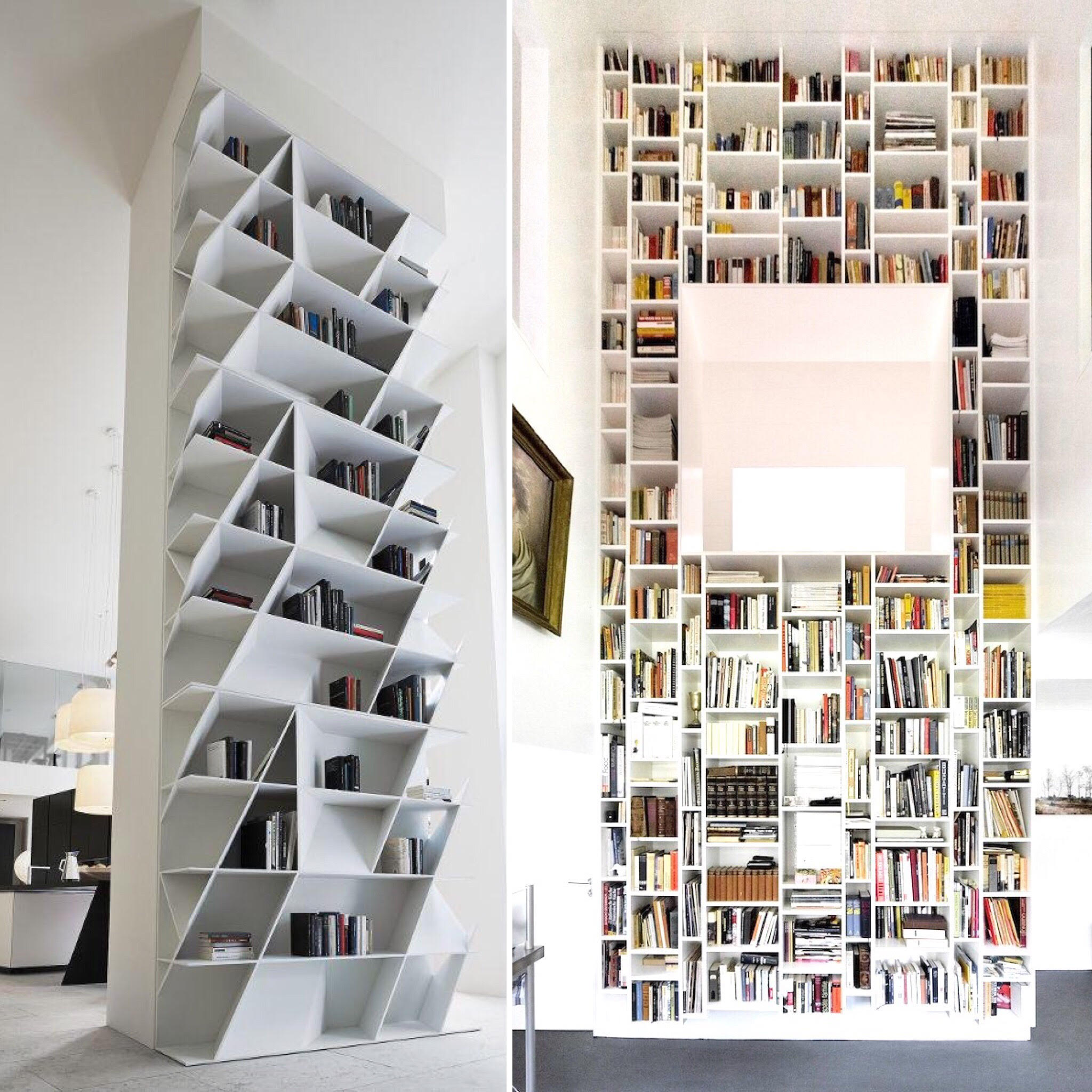
Architects, design students and artists are getting more creative with shelving than is perhaps rational (though it can be beautiful). For centuries shelving has been linear and uniform by definition, and it's a design challenge to imagine it otherwise if it is to hold our volumes. The logic stems from the physical form and also our linguistic culture. We use bookshelves instead of baskets, for example, because of the nature of the technology we call books: paper encased in covers that allow them to perfectly rest on end, side by side. In terms of directional arrangement, we order books as we do the sentences (made of words, made of alphabet therein). We set them up left to right, top to bottom, start to finish. It's not a coincidence that you search for a dewey decimal number from the left-hand side of the bookshelf, and that you scan from top to bottom as you progress through the classification scheme the same way that you read, as if the very shelves were pages in a book. These rules are an unspoken agreement in the Western world. The cultural habit even extends to how we encounter and interact with web design. The Gutenberg Diagonal is a term coined to describe user behavior that is also known as reading gravity, the way the eye falls from (again) left to right, top to bottom on a screen. The way we read informs how we encounter books, shelving, and websites alike.
Contemporary shelving design is pushing the bounds of that visual order we've held to since Gutenberg. These are fun libraries to look at: asymmetrical lines in a space, books somehow randomly organized but also in a certain order and pattern. For a librarian, the challenge is this: If shelving is unusual, the collection's organization scheme must change with it (or one must be satisfied with no method in madness). I am not pining for the client that has such shelving in their home, but it does add a decidedly modern element to that original wall-of-books feeling we all love. It makes the order (or lack thereof) an artpiece in and of itself. No word on how it feels to browse a collection on such shelves. From a distance, they are lovely.
The height of the room and the scale of the shelving in it add a bigger decision than individual shelf height or arrangement, and potentially an impactful one on the home's overall design. Floor to ceiling shelving adds drama to a room in a way that drapes, art, and windows cannot. Library ladders for certain shelving are having a renaissance. We love the nostalgia, the myth of being able to roll down a room of books as if we were Gene Kelly. The perception of ease to reach something high above is charming and old fashioned. If you have ever gone up a library ladder, you know they can be more wobbly than one would like, and if they're not wobbly, they're rather heavy to move around. If you're lucky, there will be one on each wall so you don't have to move it across the room. If you get to (read:must) use a library ladder, I suggest lifting the books by hand to as high a shelf you can reach, going up the ladder, retrieving said books, and placing them above you. To retrieve, reverse the process. You want both hands when you're going up or down a ladder. Personally I would love a 30-foot-high room lined with shelving, but the shelves above my reach on a stool (I'm tall, so that's perhaps ten feet) would have to be filled with books chosen for their spine, not their content. Or, if I must have a ladder, make it a fixed one from which I can reach the span of a wall of shelving. And make it metal (with grips for one's feet).
Source Domino Magazine.
The shelving decision that primarily dictates organizing decisions is the one that gets the least foresight and planning: overall layout. Unless the architecture is truly built around books to begin with, it is rare to find the home with one full room, one full wall, one continuous piece of shelving. Even less so the home with shelving planned specifically around the collection at hand. More often, units are divided into sections, intentionally or by happenstance: on multiple walls, or in a number of rooms. Perhaps a few pieces of furniture that were purchased through the years haphazardly. In my own home the shelves are in a number of rooms simply because that is where they fit (or where they are built in). I love having books throughout the house, but it is these odd sets of shelves that prevent me from organizing exactly as I'd like. It can be hard to meet all of a client's needs if the books that are highest priority number far too many or not nearly enough for the best and most prominent shelving. The easiest shelves to access in my home host our field guides and trail guides, the things we use most. The shelves are small, though, and the collection will soon outgrow them. Whether to add shelves in that room, divide up the collection into two locations, or move them to a less-accessible but large-enough location is yet to be seen. You can imagine how much more complicated such a decision gets with collections of 500 or 5,000 volumes on specific subject areas.
In conversations with clients about shelving, I depart from the traditional role of librarian and approach the project as a design problem. How the books rest on a surface protects them and also presents them to readers. How shelves line a room leads a number organizing decisions: the layout that makes books findable and enjoyable for their owners. The space between the shelves of books adds to (or detracts from) the overall feel of a space in which books have been given a voice. As the foundation of a place to explore and enjoy your books, shelves deserve the consideration to do the job well.
Contact me for a free consultation about built-in shelving and other furniture for books.


